Now things are getting good. Part four of my logo rank is peppered with some excellent graphic designs and for the first time, we actually see an entire family of logos with no missteps. Still some clunkers out there but the quality is greatly improved over part three. Let's see what we got.
12. New Orleans Pelicans
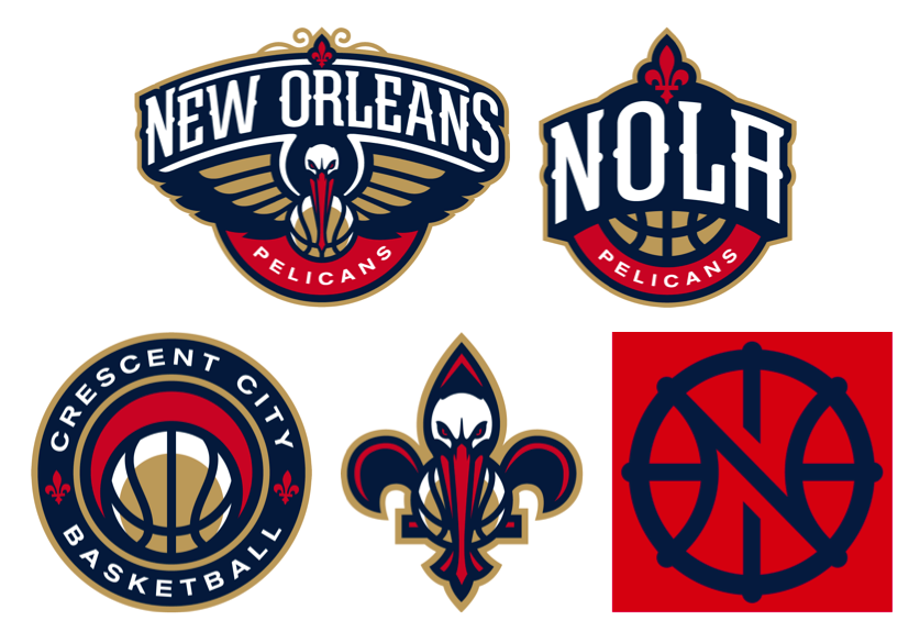
The New Orleans Pelicans are one of two franchises where three logos just wasn't enough. Oh no…for them there's a full five spot of logos to choose from. Some hit and some definitely miss wide of the mark by a good distance. But overall, there's more good than bad here. Let's start with the bad news.
I don't like the Pelicans primary logo (top left). I get that it's very New Orleans; I could see this thing gracing the front of some old paddleboat steaming up and down the Mississippi while a boatload (pun intended) of tourists check out the scenery on the banks and chow down on gumbo or red beans and rice. I appreciate the local flair but I don't like it as a basketball team logo. There's too much New Orleans and not enough hoops; I'd have killed myself for writing that in some other posts, right?
I also don't care for the Pels' fifth logo (bottom right), a weak "N"/"O"/basketball motif that somehow the Pelicans made available to themselves in four different color combinations.
Getting better, but still not there, I'm not crazy about the "NOLA" logo except I think it's more like a basketball logo than the two I have trashed so far. I really believe the Pelicans made some smart choices with their color scheme. Most logos would look good in the red, dark blue and gold colors they picked for their team. This one might have benefitted from the uni colors.
The last two logos, however, are strong to freaking awesome. I like the Pelican-de-lis a lot. It's completely New Orleans and concise enough to be a basketball centric logo at the same time. Don't get me wrong, it's no fleur-de-bee like the old Hornets had when they were in town, but I like it a lot. I especially like how the Pelican's beak forms the bottom spur of the fleur-de-lis.
And then there's the Crescent City Basketball logo, which I absolutely LOVE. New Orleans was originally laid out on a crescent shaped bend in the Mississippi River and acquired the nickname based on its early settlement patterns. This logo pays homage to that moniker and reflects a crescent shape a couple of times in the shadow on the basketball and the negative space above it. I think this logo is perfect for the city and those in the know about one of the city's other names.
So why only 12th? Well, I'm considering all logos here and the Pelicans' bad logos aren't enough to allow their good ones to soar. I've spent enough time here; let's move on.

11. Philadelphia 76ers
Oh, Philadelphia, you had it so right and you went and messed it up.
I LOVE the old 76ers logo. It's a basketball looked at almost straight on with that gorgeous "76" and the 13 original stars from the first Stars and Stripes floating above. It's graphically balanced and it's a perfect reflection of a basketball team named the 76ers. Admittedly, the old logo is much like the current primary logo (above left). But the old logo placed the ring of stars so it doesn't break the seam of the basketball. It's the small things in life sometimes. The Sixers used the old logo from 1977 to 1997 and brought it back just six years ago before tinkering. Should have left it alone.
Having said all that, the current logo is almost as good and I dare say I like the alternate logo on the right above just as much as the old logo that I love.
But Ben Franklin dribbling a basketball? This thing doesn't seem right, plus an 11 year old kid can't draw that. No way. I predict Ben will be shelved in the next few years. Heart's in the right place. I'm just not getting it.
Good show from the Sixers here. If they'd have left things alone they would have been top ten for sure.

10. Portland Trail Blazers
Of all the logos in the NBA, there has to be more confusion surrounding the Portland Trail Blazers logo than any other graphic representing a team. Let me explain why this logo is good enough for 10th in the league in this particular ranking.
Look at any other logo in the NBA and you could probably take a shot at guessing the team nickname. OK, maybe not the Magic but you would at least stand a chance of saying "oh, I get it!" when someone gave you the answer. And maybe not the Thunder either but after some cajoling and explaining, you might get it enough to beg off whatever Thunder fan was giving you a tutorial on the subject.
But the Blazers? The team that was named after the folks who moved out to Portland on the Oregon Trail. No way can you make sense of this. It didn't always look quite this way but it's close enough to the original to make a strong connection and the Blazers have stuck to this look in a totally unwavering fashion with the possible (and I mean very possible) inexcusable introduction of a less sensical secondary logo in 2002 that they killed four years later. Hooray for tradition!!!!
The reason the Portland Trail Blazers logo makes no sense is that it was generated from a when, not a what. And that's just the exact same reason it is so awesome. It's a design that signifies a modern (and by modern I mean 1970 when the Blazers entered the league) interpretation of the game of basketball. The five lines on each side of the center circle represent two teams of players working against each other in a game of hoops. Get it? It doesn't necessarily matter if you don't. I think it's so awesome that they commissioned this type of logo and stuck with it exclusively for 45 years. There's no other NBA logo like it. And there likely never will because there will likely never be another 1970.

9. Charlotte Hornets
The Hornets are another team (like the Pelicans) who can't seem to have enough logos. They actually have six but the other two not shown above are just variants of the primary logo on the left above.
I love pretty much everything about the Hornets re-brand. Anything in Charlotte (well, except a Raptors nickname) would have been an improvement over the dreadful Bobcats name. They could have just brought back the old friendly hornet from the late 1980s but I'm glad they didn't. I like the newer fiercer Hornets collection of logos better than the cuddly cartoon one.
Just like the Pelicans, I think this collection of logos is a bit of a mixed bag, although far superior to the Pels' choices. I like the primary logo. I think it's visually stunning on a first glance although I do think the appeal wears off over time. I'm not a fan of the second logo above (what I'll call the "Queen City" logo) which is very reminiscent of one of the old Bobcats' logos. I'm not knocking it just because it reminds me of the Bobcats; it's actually pretty awful other than the hexagonal shaped "C". I'm not sure if MJ told his re-branding firm to give him a discount if they could re-use one of the old Bobs' designs or what. Memo to the entire Hornets franchise: don't ever go back to anything even smacking of Bob Johnson's ego drive nickname.
But the last two logos on the right I really like. The hornet in profile looks dangerous in attack mode. It's dynamic and forceful and I love both the basketball in the hornet's venom filled belly and the fact that the hornet's attack stance makes an abstract "C". I also like the Buzz City logo inside the hexagonal hornet's nest cell shape, although I don't believe Charlotte is actually referred to as Buzz City except as the home of the Hornets. I still like it. I'd wear shirts with this logo on it.

8. Miami Heat
I hate the Miami Heat. I hate that they swept the Wizards 4-0 in the second round of the 2005 playoffs (long memory here) and I hate that they conspired to stack the deck against the rest of the league by teaming up LeBron James, Dwayne Wade and Chris Bosh to make four straight finals. If it wasn't for the state of Texas, they might have won all four. Ha ha by the way.
I love the Miami Heat's primary logo. It's only slightly different in color from the original 1988 logo and that's quite honestly because whoever designed this logo got it right the first time. You never need to change this logo, Miami. EVER! I've written about how difficult it is to represent abstract terms like Magic and Thunder in logos. The Heat have done it perfectly here with their nickname. It simultaneously represents their name, the concept of heat and references basketball by showing a shot from an "on fire" shooter dropping through the hoop. Yes, I know, there's no net.
So on that basis, the Heat should be like top one or two right? Well…no, because in 2008, the Heat decided to introduce the absolutely horrendous "MH" alternate logo. I don't even want to write about this thing. It's clunky, ugly and I hate the way the M and the H are merged. You are costing your team a top spot here, alternate logo.

7. Golden State Warriors
To this point in my countdown, there have been no teams who's set of logos I like across the board. The Warriors change that.
In 1969, the San Francisco Warriors introduced a new circular logo showing the Golden Gate Bridge in silhouette with the words "The City" above the logo. The current Warriors logo introduced in 2010 is an updated more modern version of that logo and it's a killer design. It represents the Bay Area, reflects the tradition of the Warriors and is worn on their uniforms in a way that no other logo in the NBA is. I love it. And I think so do the majority of other people across the league.
I also really like the other two logos introduced by the team as part of their re-brand. Yes, the "W" in a circle is pretty simple but it's straightforward and elegant. I love the California map logo also. I am generally in favor of putting maps in any sort of graphic representation. This one works especially well because the Warriors are (currently) named after the entire state of California.
So why aren't the Warriors higher? Well, it's because while I can enjoy each of the logos on its own and as a total collection, there's nothing that amazing about any logo except the primary logo.
The last six are next. In alphabetical order by city: Boston Celtics, Chicago Bulls, Memphis Grizzlies, New York Knicks, San Antonio Spurs, Washington Wizards.
No comments:
Post a Comment