September 27, 2015

Basketball Movies


The 2015-2016 NBA season is almost here. Media Day for the Wizards is tomorrow, training camp opens the next day and the first preseason game is just nine days away. Finally after a couple of months of waiting and waiting for something to happen, something finally IS happening. Here we go again.

With the start of regular season less than five weeks away, there's one other thing I know for certain and that's at some point in the next six months, I'll be hopping in a car, on a train or boarding a plane to watch my beloved Wizards play somewhere in this great country of ours other than D.C. I've already picked out a weekend in New Orleans when the Wizards visit the Big Easy this year and I've circled the Clippers and Lakers road games (on consecutive Sundays in the spring) as a possible second trip. I need to get some Western Conference venues under my belt and hitting L.A. in the spring seems perfect to do that.

As if it wasn't enough for me to shoot for being there for all 41 home games and a couple of road games each year, I need some basketball related entertainment while I'm on my way, particularly sitting in smaller and smaller coach seats on flights every year. So over the last decade or so in addition to watching a whole lot of hoops in person, I've watched a whole lot of hoops movies on my iPad Mini (and my iTouch before that) while heading to Philadelphia or New York or Milwaukee or Vegas or Miami or wherever else my travels have taken me. And there are some really good ones out there.

So to tip off this season right, I thought I'd share the best five basketball movies I've watched over the years with the dozen or so folks who read this blog. As a disclaimer in advance, I should note my bias towards truth over fiction. As much as I love Shaq and Penny Hardaway in Blue Chips, you won't find that flick in my top five. And yes, I've relied heavily on ESPN's 30 For 30 series in the past couple of years. Some of those films are fantastic; it makes me almost appreciate Bill Simmons (almost) for what he started there.

Like any best of list, I'm sure there is room for plenty of discussion and debate. Let me know where you think I've erred. Who knows, maybe I missed a real gem. There are for sure a lot more hours I'm going to be spending traveling to games. Here are my top five so far.


5. Broke
OK, so Broke is not really a basketball movie but for sure the majority of the stories in this film are about pro football and pro basketball stars who have made millions and gone stone cold broke. As a study in what happens to a lot of suddenly highly paid, financially inexperienced young men with all sorts of hangers on, this is essential watching for the NBA fan.

On one level, this film is hilarious. Half of the stories about how these guys parted with more money than most people make in a lifetime seems like complete fantasy: hundreds of thousands of dollars of custom jewelry; investment schemes from the predictable (restaurants) to the bizarre (furniture fitted with inflatable bottoms so you could float your furniture in the event of a flood); to making it rain in strip clubs with hundred dollar bills; to just plain gambling millions of dollars away. I remember Andray Blatche had a custom number seven Wizards jersey necklace that must have cost a fortune hanging around his neck one season. I wonder what that's worth now.

The characters that are real life guys are also classic. Andre Rison in his custom tailored suit and dark sunglasses telling all sorts of tales; Bart Scott talking about cashing his first NFL paycheck at a check cashing joint; Jamal Mashburn owning a Ferrari he can't drive because it's a stick shift; and Leon Searcy in his Sanford and Son "How 'bout 5 'cross your lip?" t-shirt. Rison and Mashburn and Scott look great. I'm sure they still have plenty of cash left. Leon Searcy and Keith McCants and Bernie Kosar…not so much.

But most of the stories are pretty sad. Stupid decisions are one thing and getting involved with women you hardly know and joint bank accounts is probably inadvisable. But the worst sort of predators in this film are the people the players are supposed to trust: parents, advisors and coaches. Hearing Bernie Kosar say he'd rather his dad have some more of his money than feel guilty about disappointing him just isn't right. I remember the Wizards' Cartier Martin trusted a former AAU coach with investing his money only to lose $375,000 when the Ponzi scheme the guy was running collapsed and he killed himself. Not smart but sad at the same time.

If we need proof of how important this film is, I can't remember any other movie release sparking such questions on Twitter of professional athletes, all of which wanted to know (a) had they seen it and (b) what did they think. A lot of guys in the NBA watched this on ESPN when it first ran and a lot of guys paid attention to it. It may not be a movie solely about basketball, but it's all about the NBA.


4. Winning Time: Reggie Miller vs. The New York Knicks
As a former New York Knicks fan, I feel bad about putting this film in my top five. But it's honestly an awesome movie.

From 1993 to 2000, the New York Knicks and Indiana Pacers met in the NBA Playoffs six times. Eight years, six series. In three of those six years, the winner of the Pacers-Knicks series went on to represent the Eastern Conference in the NBA Finals. These were important battles between two really good teams. And they were vicious. This was the kind of drama that you don't find in the NBA nowadays because the league has just cut out all this sort of conflict.

This film is all about Reggie Miller, the Pacers' now Hall of Fame shooting guard who took center stage in each matchup with the then-bad boy Knicks anchored around Patrick Ewing, John Starks, Charles Oakley and Anthony Mason with a little dash of Greg Anthony thrown in for good measure. Back in the 1990s I hated Reggie Miller. He whined. He complained. He pushed and claimed innocence. He trash talked. And he shot the lights out and kept the Pacers in it.

Reggie was truly the game's number one irritant back then. This film is worth it just for the scene where Michael Jordan loses it with Miller and tries to choke him. Following that fight, it's easy to see how John Starks, who I love to death, lost his cool and headbutted Miller in the 1993 playoffs. He didn't hit him as hard as Miller pretended in the subsequent flop but he did make contact. Considering the subsequent suspension, I'm sure John wished he'd laid Miller out for real.

Maybe this film hits me the way it does because I remember the Knicks-Pacers rivalry so fondly and those battles produced two Knicks Finals appearances. Eventually of course, Reggie beats the Knicks. But the best line in the movie for Knicks fans is the last one. I won't spoil the surprise.


3. The Other Dream Team
The Other Dream Team begins with the Soviet Union defeating the United States in the gold medal basketball game of the 1988 Olympic Games in Seoul, South Korea. An hour and a half or so later, it ends with Lithuania claiming their bronze medals for basketball at the 1992 Olympic Games in Barcelona wearing tie-dyed shirts provided by the Grateful Dead. And both are victory scenes. 

In between the two medal ceremonies, the movie tells the story of a country with a proud basketball tradition gaining their basketball and actual freedom from a nation that had occupied their lands for 50 years. Of the five starters on the 1988 Soviet Union gold medal winning team, four (Arvydas Sabonis, Sarunas Marciulionis, Rimas Kurtinaitis and Valdemaras Chomicius) were Lithuanian. They were labeled by most of the rest of the world that didn't know any better as Soviets or (even worse) Russians. If you watch this film, you'll be pretty convinced that they were never either of those two things.

This movie is a tear-jerker. I'm serious. There are some truly awful things happen here, from deportations to Siberia to tanks crushing peaceful demonstrators. As a college kid in the United States reading the newspapers in the late 1980s and early 1980s, change in the Soviet Union seemed so benign and Mikhail Gorbachev seemed so different from past Soviet leaders. Watching this movie really provides a lot of perspective and re-sets my own version of history from my coddled existence in Ann Arbor, Michigan and Syracuse, New York. The struggle for independence in Lithuania was real and it cost a lot for some people. It's absolutely heartbreaking in spots.

There are some great triumphs in this movie and watching film of Arvydas Sabonis is always amazing no matter his age. But by all rights you'll walk away from this film changed a little and hopefully inspired at the same time. Please watch it. A few years ago, the Wizards played Zalgiris Kaunas in a pre-season game at Verizon Center. I wish I'd known about the history of that club before I attended that game. Missed opportunity. The only thing I can do from here is make up for it.


2. Hoosiers
Look for any sort of top ten sports movies of all time and you will likely find Hoosiers on the list or at least near the top. It's a David and Goliath story of tiny fictional Hickory High taking their shot at glory and the Indiana state basketball title under beleaguered head coach Norman Dale played by Gene Hackman. 

The movie is set in the 1950s and is pure heartland of America folklore in a place that most people associate as the breadbasket of basketball. Sure, Dr. Naismith may have invented the game at the Springfield YMCA but the game grew up in the midwest. Indiana's the perfect place to set this movie.

At number two on my list, Hoosiers is the only fictional work in my countdown. But before you dismiss this too good to be true story as untrue, it is actually based in fact, loosely telling the story of the 1954 Milan High School team that did in fact win the state title despite apparently long odds.

To show how much I love this movie, I've owned it on VHS, the deluxe two-DVD re-issue (I think for the 20th anniversary of its release) and now as an HD version on iTunes. I love Gene Hackman in general and he's great in this film as the uncompromising my way or the highway believe in fundamentals at all costs head coach clinging to what is surely his last shot. He literally has nowhere else to go. Clips from the film regularly appear at crunch time in NBA arenas all over the country.

Yes, it's confusing when Buddy suddenly appears back on the team. My DVD reissue explains how that happened. I could watch Hoosiers over and over and over again. I need to get to the gym where they filmed the movie one of these days. I see a road trip eventually through central Indiana. Not this year but maybe one day.


1. Once Brothers
The reason Hoosiers is not my number one basketball movie of all time is because Once Brothers is just that good of a movie. It looks like it was made on a shoestring budget (I'm sure it wasn't) but the story here is just so incredible.

The Other Dream Team told the story of a country coming together using the national basketball team as a metaphor for the nation's re-birth. Once Brothers tells the story of a nation coming apart over ethnic lines which destroys the friendship of two of the first European stars to play in the NBA. I can't begin to try to understand what the dissolution of the former Yugoslavia meant or what it did to the relationships between men from Croatia and Serbia who might have known each other. All I can say is this film genuinely breaks my heart.

The story is told from the perspective of Vlade Divac, who is Serbian, about the loss metaphorically and ultimately literally of his friend Drazen Petrovic, who was Croatian. In 1988 the two men started on Yugoslavia's national basketball team and won a silver medal at the 1988 Olympic Games. Two years later they would take home gold medals from the 1990 FIBA World Championship. Yugoslavia started to collapse the very next year with the secession of Solvenia and the dissolution of that country would eventually devolve into ethnic cleansing and horrible war crimes.

Divac was always one of my favorite NBA players (I love big men who can pass) and so I'm naturally interested in his story. But more than that, I think this is a tragic tale of what we let happen to each other and how we fight and kill each other over things that ultimately make little sense like national boundaries and hatred between people who are different from one another. 

It's difficult to understand if Divac's story is biased or untrue (ultimately there is bias in everything, I suppose) but I believe he is genuinely hurt by the divide that existed between him and Petrovic over something that leaders of their countries were fighting over. Petrovic was one of the first players from Europe to find real success in the NBA but his career and life were cut short by a fatal car accident during the 1993 NBA offseason. His death obviously prevents him from telling his side of the story.

There's little joy in this movie but you get a sense at the end of the film that Divac achieves some sort of closure, which I guess is all you can hope for. But the 75 plus minutes you spend watching this movie are powerful and meaningful and I've watched it several times. It's terrible what we do to other people but it's worth it to sit through at least once. Not happy. But better than any other basketball film I've seen.

So that's my list. What am I missing? He Got Game? Hoop Dreams? Other films yet to be released. I'd love a comment or two pointing me towards something I haven't seen yet. Wizards Media Day tomorrow. Can't wait, even though pretty much nothing happens that day.


September 13, 2015

NBA Mascot Rank Update 2015


Who'd have thought two years ago when I initially ranked the 30 NBA teams' mascots (note, not 30 mascots) that I'd have to update it one year later and then again this year. Not me. But such is life in the dynamic, ever-fickle world of NBA mascots. After an update last September to make sense of Hugo the Hornet returning to Charlotte; Pierre the Pelican being born and then switching beaks; not to mention the euthanasia of the BrooklyKnight, I'm back this year with yet another update. 

For sure, not much has changed since last year. In fact, there's only been one new mascot introduced and none have been removed so this should be fairly straightforward. But just for good measure I've shaken things up at the bottom a little and I renew my constant request for change in one NBA city. Let's get right to it. The rankings are, as always, in reverse order.


30. Los Angeles Clippers
Because of the Clippers horrendous 2015 re-brand (and I guess the fact that they signed Paul Pierce away from the Wizards), Los Angeles' second team finishes last in just about everything that I'm ranking that doesn't involve on court play. It's terrible. It's terrible. It's terrible. 

Now, there is a report that the Clips are bringing a mascot into the mix. Please don't rush this one, Steve Ballmer. Do it right. I don't have high hopes for this effort based on recent history but at least do enough to get above all the teams without a mascot. For now, you are last in everything.

29. New York Knicks
For the last couple of years, I have generally placed teams without mascots at the bottom of my ranking due to just lack of effort. This year I'm doing the same, but ranking those teams not on emotional concepts like "I used to be a Knicks fan" but instead based on order of finish in the prior NBA season. 

Last year the Knicks were a franchise history worst 17-65. The Knickerbockers had never finished with wins starting with a "1" in a season before. Last year they bested, or worsted if you prefer, the poorest Wizards showing since I've been a fan. Bravo, Knicks. Be thankful the Clippers re-branded.

28. Los Angeles Lakers
Speaking of historical worsts…

Just like the Knicks in New York, the Lakers also set a franchise mark for futility in a season in their current city. The Lakers' mark: 21-61. Ouch! It's so bad for their franchise that the list of season by season records on the Lakers' website doesn't even show last season. Their only saving graces? They had one season worse than last year while they were in Minneapolis, the Knicks were worse last year and the Clippers re-brand still sucks. 

I expect the link to Lakers' records to be fixed at some point. Just in case the like I provided doesn't work or is corrected…

27. Brooklyn Nets
Last year the Nets got a lot of credit for killing off their awful mascot. This year, they finish where they should based on lack of mascot effort and their on court performance. Think of a new mascot, Brooklyn.

26. Golden State Warriors
The dubs are the highest ranked team without a mascot this year in my mascot rank since they, um, just won the NBA title. Think the Warriors care they don't have a mascot? They shouldn't. Nor should they care about this blog post.

25. Boston Celtics
Still a dude obviously dressed in clothes. I cannot suspend imagination that it's anything but a human. Still last of the teams that actually bother to field a mascot.

24. Miami Heat
I still have no idea how to explain what Burnie is. I still love the name. I'm just at a loss. Not close to being passed by the C's but still last of the actual mascots.

Spots 23-17 are my non-sequitur spots. Mostly. These are mascots who when I look at them I have no idea what the team name would be. So just to prove a point, the teams are listed with their team names based on their mascots.

23. Houston Bears
The Houston franchise's mascot is named Clutch. Clutch is a bear. Should be a rocket I think. I'd settle for an astronaut.

22. Indiana Cats
Indiana's mascot is named Boomer. He's a cat. I'd take a horse or a racecar here. See my first discussion of Indiana's mascot for an explanation why.

21. Portland Cats
I guess it would be really confusing if two teams had the same nickname but that's the way it is. Blaze, like Boomer before him, is a pussy cat. I get that the Portland franchise has it tough mascot wise but nobody forced them to be called the Trail Blazers.

20. Toronto Raptors
OK, so Toronto's mascot is perfect for their name. Their name is just terrible. Huskies, please, Toronto.

Come on, Phoenix. You KNOW you want this guy as your mascot, right?
19. Phoenix Gorillas
I still can't fathom why the Phoenix team has an ape for a mascot and I still don't like it. Moreover, I still can't believe this mascot is revered by NBA fans. I've already pointed out a couple of times that scrapping Go the Gorilla would involve a small under the table payment to a certain breakfast sausage maker. You could even hire the same guy who plays the sun on the Jimmy Dean commercials, I'm sure. And yes, I know that it's obviously a dude dressed up as a sun and therefore should get the same scrutiny as the Celtics' obviously human mascot but I promise I'll rank you higher. Promise!

18. Memphis Pig-Bears
Squint and you could believe that Grizz the Bear is actually a bear. Or you could just as easily get a furry pig. Again, see my first discussion for the whole story. At least change the fur color to grizzly bear color, Memphis.

17. Utah Bears
What's the deal with bears and cats as mascots for teams not named the bears or cats? Utah's got the best looking one of the bunch so they finish highest. In a fight, I'm taking the Jazz Bear over Clutch any day.


16. Philadelphia Dogs
The Philadelphia franchise has the only new mascot this off-season and it's I guess good enough to finish at the top of the non sequitur group. Barely.

Philadelphia's new entry into the world of mascots is not a 76er as their actual franchise name would suggest. Nor is it a rabbit like their last mascot, Hip Hop (thank God!). Nope, it's some sort of blue cartoon-y dog named Franklin who vaguely resembles the dog Blue from the Blue's Clues kids book.

On the relevance scale, I'd say Franklin has none. He's passable on the appearance scale; I mean he's not ugly, is clearly not a cross species hybrid like Memphis' mascot and he has home and away jerseys which I love but also don't get (since mascots don't go to road games). The name is perfect for Philadelphia especially considering their introduction of a dribbling Ben Franklin as one of their alternate logos.

Franklin's an improvement over nothing, I guess, but he's only this high because NBA teams cannot for the life of them produce good mascots. We'll see how long the good people of Philadelphia let him stay around. On the other hand, that might be a while. Does anyone even go to Sixers' games anymore?

15. Cleveland Cavaliers
I still love Moondog. I still don't like C.C. I also still don't like the Cavaliers. Stuck in 15th again.

14. Minnesota Timberwolves
The Wolves have a wolf for their mascot. Awesome. It's still the worst looking relevant mascot of teams that have acceptable team names (see Toronto above for unacceptable team names).

13. Dallas Mavericks
Dallas' mascot is named champ. Might want to re-think that name soon. Maybe Former Champ?

12. Sacramento Kings
I still love Slamson's name and the fact that he's a lion. But man, this thing is not attractive at all.

11. Detroit Pistons
The Pistons are still getting more out of nothing than any other franchise with their mascot, Hooper. It's just not as good as the ten ahead of it.

10. New Orleans Pelicans
Pierre stays strong as the number ten entry in the Big Easy. I'll be down December 11 for the Wizards' annual game. Save me a seat. We can discuss how you can move up over a bowl of gumbo after the game.

9. Oklahoma City Thunder
What the Thunder can't do with their name and logo (that is...come up with a good one), they knock it out of the park and more with Rumble the Bison. How more perfect a mascot for a team in Oklahoma is there? I can't think of one. Consider a re-brand but don't get rid of Rumble.

8. Atlanta Hawks
Harry the Hawk drops a spot this year to eighth strictly on my kind imaginings of what this mascot is going to look like in that awful new Mr. Yuk green that the Hawks decided to use for one of their uni colors this year. I'll wait and see what happens but it wouldn't be out of the realm of possibility for Harry to be much lower next year.

7. San Antonio Spurs
The first classic mascot that is not a gorilla in my opinion. Moves up a notch because the Hawks can't leave well enough alone. Probably belonged ahead of the Hawks anyway.

6. Denver Nuggets
Unlike Harry the Hawk, Rocky the Mountain Lion is good in any color. Holding strong at number six for the second year in a row.

5. Milwaukee Bucks
I love the Milwaukee Bucks' new colors and logos. Bango won't miss a beat in his new duds. Still have a soft spot for Milwaukee based on my trip there a couple of years ago but it's not affecting my ranking of Bango. Solid all around.

4. Chicago Bulls
You can't be the best in everything, Chicago. You won my logo rank earlier this summer. Benny stays (legitimately) at number four. And I really don't see any way you can move up unless the three ahead of you mess something up.

3. Orlando Magic
I still think Stuff is a crazy good mascot. Perfect look, perfect name and totally relevant. Nowhere else but Orlando…

2. Charlotte Hornets
Of all the classic mascots, Hugo is for sure the best. Pretty much perfect in every way. Just to clarify, my classic mascots sit at numbers seven, six, five, four and two in this ranking. And OK, if you want to include Go the Gorilla here, that's fine too. Those six are the Mount Rushmore plus two of NBA mascots. However, he's still not number one.


1. Washington Wizards
That's right, G Wiz is number one in my mascot rank for the third year in a row. How can you get any more awesome than this mascot? I don't see this ranking changing any time soon. Don't screw this one up Wizards.

Two disclaimers as usual here. (1) This is not a homer pick. G Wiz looks awesome, the name is relevant and he represents the nickname of the Washington franchise. (2) I'm pretending G Man doesn't exist.

45 Days to the season opener. I cannot wait!!!!

August 29, 2015

NBA Logo Rank, Part 5


August is almost over, that means my logo rank is also almost over. Actually when you have read this (or just looked at the pictures), it will be. Let's find out who I have number one. But first…number six.

6. San Antonio Spurs
How great is the Spurs franchise? They have five titles in the last 15 or so plus years, they are the model of consistency and team play and they have this awesome logo. Sometimes, it really is about the simple things and you can't get a whole lot simpler than the Spurs have here. I mean it's really nothing more than a boot spur doubling as a "U" in the Spurs name but it just works perfectly. No fuss, nothing fancy. Just like the team it represents. No complaints here. Nothing but praise.


5. New York Knicks
If this ranking were about primary logos only, the Knicks would do about as well as their team did last year, which if you weren't paying attention, would be just about dead last. The Timberwolves kept the Knicks out of the NBA basement last season. The Clippers would certainly keep the Knicks out of the 30 spot on this rank based on primary logo alone.

So the primary logo is a basketball with the word Knicks in astonishing three dimensional font above and a triangle in back. Not good. Not really anywhere close. The logo used to not have the triangle. I hope the team didn't pay too much for someone to re-vamp their image and end up with just a triangle to add. I'd ask for my money back if that's what happened.

But the other two logos? Stunning. The "Knicks" in the basketball is so super simple and obvious but it's graphically brilliant. It helps that the Knicks colors are blue and orange so they can use the actual color of the basketball as a background to their team name.

And then there's the subway token logo. Long long ago before paper or plastic slide or touch subway cards, pretty much all subway systems in the United States used a token, something resembling a coin that you placed in a slot that allowed you to walk through the turnstile. Now, of course, most of these are all gone, although I did get to use some in Philadelphia when I visited last year to watch the Wizards take care of the Sixers. New York's subway tokens had a large central "Y" shaped cut into the center of the token with an "N" on the left and a "C" on the right. The Knicks have used that exact same token design substituting the "K" for the "C." It's absolute genius. The New York City subway is the most famous in the United States. I can't think of a better way to honor the city than converting the token into this logo. I love it.


4. Memphis Grizzlies
My list of all-time favorite NBA logos is pretty short. I haven't actually made one but it's not a bad idea to write about that subject in some later August. If I had made one, the Memphis Grizzlies bear head logo (the center one above - minus the words below it) would be very near the top of that chart. I love this graphic. It's abstract without being cartoon-y, stern and serious without being too scary and I love the half sun / half shadow thing its got going on. I was in Memphis in 2007 and actually thought about buying a shirt with this logo on it in the team store before I came to my senses and realized I couldn't really wear any other team's apparel. I think this is the best logo in the NBA today. No question about it.

BUT…this ranking is a list based on all of each team's logos and honestly, the yellow-orange ball in the blue bear claw just doesn't do anything for me. Pass. This logo drops the Grizz from first to fourth. The Celtics, Bulls and Wizards thank you for it.


3. Washington Wizards
Homer pick? Maybe. But I really like this set of logos that the Wizards introduced in 2011. They completed Ted Leonsis' re-brand this past offseason by killing the Wizard jumping over the moon logo which had served as the primary logo for the team either in the original blue, black and bronze scheme or the slightly tilted red, white and blue scheme since the team ditched the Bullets name. That move bumped the Wizards up a bunch of spots into the number three spot.

The "Unity Hand" logo (above, center) is a throwback to the old Bullets logo, which featured the two "l"s in the middle of the word as hands reaching skyward to catch a basketball. Since there are no double "l"s in either Washington or Wizards, this is the re-interpretation we ended up with. I like how it echoes the past, especially with the retro looking basketball. I don't particularly like the font but the letters clearly spell out "dc" which is good enough for me.

The "Monument Ball" logo is a number of things all at once. It's a basketball but also includes the Washington Monument which is so prominent on the city's skyline and a star echoing the three stars in the flag of Washington, D.C., a design patterned after George Washington's personal coat of arms. I loved the Monument Ball since the day it was released and I was pleased this past spring when the team elected to make it their primary logo. I find this choice surprising since this logo is not featured on the court but whatever.

There's nothing weak here. I love the designs and the colors. I'd say a strong number three. Who you got below the Wizards that is better? Name one and let's have it out.


2. Boston Celtics
You can't get much more classic a logo than the Celtics primary logo. For as long as I can remember this has been the Celtics logo and for good reason. This HAS been the Celtics logo since 1968 which is the year of my birth. True, until 1996 the logo just had two colors (green and white) and before 1976 there was a reddish basketball behind the figure but as far as I'm concerned, the C's have just had one logo. I mean, if it ain't broke, why fix it? Classic works, right? Don't mess with a good thing.

And so that's just the thing with the Celtics logos. They went and messed with it. Until 1998, the Celtics primary logo was good enough. Better than good enough, actually. Maybe the best in basketball considering design and tradition (I know I've just said the Grizzlies head is the best logo in the game today; that logo didn't exist in 1998). But marketing or whatever else got the best of the C's and they felt like they needed to add a shamrock logo. OK, not disastrous. They can probably still finish on top.

But then a year ago, Boston went and introduced the silhouette Celtic logo. I mean OK, it's not horrendous but it's weak enough that for me, it dilutes the branding. Everyone's got to have a second and third logo, right? Well, almost everyone...


1. Chicago Bulls
50 years. One logo. That's right the Chicago Bulls are the only franchise that has never ever ever changed their logo or added a second logo. With this design, they don't need one. I don't know what else to say here. This image is just about perfect. It's an angry bull with red tips on its horns. It's mean, threatening and is one of the classic sports logos ever. I hate that the Bulls ended up number one here but I don't know who else can do any better than this. 

That's it. That's the end. Don't agree with any of my opinions? That's fine. You don't have to. I'm always open to discussion about this subject or anything else about the NBA. Give me a heads up and I'll meet you before the next Wizards game.

August 19, 2015

NBA Logo Rank, Part 4


Now things are getting good. Part four of my logo rank is peppered with some excellent graphic designs and for the first time, we actually see an entire family of logos with no missteps. Still some clunkers out there but the quality is greatly improved over part three. Let's see what we got.

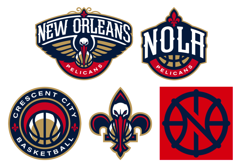
12. New Orleans Pelicans
The New Orleans Pelicans are one of two franchises where three logos just wasn't enough. Oh no…for them there's a full five spot of logos to choose from. Some hit and some definitely miss wide of the mark by a good distance. But overall, there's more good than bad here. Let's start with the bad news.

I don't like the Pelicans primary logo (top left). I get that it's very New Orleans; I could see this thing gracing the front of some old paddleboat steaming up and down the Mississippi while a boatload (pun intended) of tourists check out the scenery on the banks and chow down on gumbo or red beans and rice. I appreciate the local flair but I don't like it as a basketball team logo. There's too much New Orleans and not enough hoops; I'd have killed myself for writing that in some other posts, right?

I also don't care for the Pels' fifth logo (bottom right), a weak "N"/"O"/basketball motif that somehow the Pelicans made available to themselves in four different color combinations.

Getting better, but still not there, I'm not crazy about the "NOLA" logo except I think it's more like a basketball logo than the two I have trashed so far. I really believe the Pelicans made some smart choices with their color scheme. Most logos would look good in the red, dark blue and gold colors they picked for their team. This one might have benefitted from the uni colors.

The last two logos, however, are strong to freaking awesome. I like the Pelican-de-lis a lot. It's completely New Orleans and concise enough to be a basketball centric logo at the same time. Don't get me wrong, it's no fleur-de-bee like the old Hornets had when they were in town, but I like it a lot. I especially like how the Pelican's beak forms the bottom spur of the fleur-de-lis.

And then there's the Crescent City Basketball logo, which I absolutely LOVE. New Orleans was originally laid out on a crescent shaped bend in the Mississippi River and acquired the nickname based on its early settlement patterns. This logo pays homage to that moniker and reflects a crescent shape a couple of times in the shadow on the basketball and the negative space above it. I think this logo is perfect for the city and those in the know about one of the city's other names.

So why only 12th? Well, I'm considering all logos here and the Pelicans' bad logos aren't enough to allow their good ones to soar. I've spent enough time here; let's move on.


11. Philadelphia 76ers
Oh, Philadelphia, you had it so right and you went and messed it up.

I LOVE the old 76ers logo. It's a basketball looked at almost straight on with that gorgeous "76" and the 13 original stars from the first Stars and Stripes floating above. It's graphically balanced and it's a perfect reflection of a basketball team named the 76ers. Admittedly, the old logo is much like the current primary logo (above left). But the old logo placed the ring of stars so it doesn't break the seam of the basketball. It's the small things in life sometimes. The Sixers used the old logo from 1977 to 1997 and brought it back just six years ago before tinkering. Should have left it alone.

Having said all that, the current logo is almost as good and I dare say I like the alternate logo on the right above just as much as the old logo that I love.

But Ben Franklin dribbling a basketball? This thing doesn't seem right, plus an 11 year old kid can't draw that. No way. I predict Ben will be shelved in the next few years. Heart's in the right place. I'm just not getting it.

Good show from the Sixers here. If they'd have left things alone they would have been top ten for sure.


10. Portland Trail Blazers
Of all the logos in the NBA, there has to be more confusion surrounding the Portland Trail Blazers logo than any other graphic representing a team. Let me explain why this logo is good enough for 10th in the league in this particular ranking.

Look at any other logo in the NBA and you could probably take a shot at guessing the team nickname. OK, maybe not the Magic but you would at least stand a chance of saying "oh, I get it!" when someone gave you the answer. And maybe not the Thunder either but after some cajoling and explaining, you might get it enough to beg off whatever Thunder fan was giving you a tutorial on the subject.

But the Blazers? The team that was named after the folks who moved out to Portland on the Oregon Trail. No way can you make sense of this. It didn't always look quite this way but it's close enough to the original to make a strong connection and the Blazers have stuck to this look in a totally unwavering fashion with the possible (and I mean very possible) inexcusable introduction of a less sensical secondary logo in 2002 that they killed four years later. Hooray for tradition!!!!

The reason the Portland Trail Blazers logo makes no sense is that it was generated from a when, not a what. And that's just the exact same reason it is so awesome. It's a design that signifies a modern (and by modern I mean 1970 when the Blazers entered the league) interpretation of the game of basketball. The five lines on each side of the center circle represent two teams of players working against each other in a game of hoops. Get it? It doesn't necessarily matter if you don't. I think it's so awesome that they commissioned this type of logo and stuck with it exclusively for 45 years. There's no other NBA logo like it. And there likely never will because there will likely never be another 1970.


9. Charlotte Hornets
The Hornets are another team (like the Pelicans) who can't seem to have enough logos. They actually have six but the other two not shown above are just variants of the primary logo on the left above.

I love pretty much everything about the Hornets re-brand. Anything in Charlotte (well, except a Raptors nickname) would have been an improvement over the dreadful Bobcats name. They could have just brought back the old friendly hornet from the late 1980s but I'm glad they didn't. I like the newer fiercer Hornets collection of logos better than the cuddly cartoon one.

Just like the Pelicans, I think this collection of logos is a bit of a mixed bag, although far superior to the Pels' choices. I like the primary logo. I think it's visually stunning on a first glance although I do think the appeal wears off over time. I'm not a fan of the second logo above (what I'll call the "Queen City" logo) which is very reminiscent of one of the old Bobcats' logos. I'm not knocking it just because it reminds me of the Bobcats; it's actually pretty awful other than the hexagonal shaped "C". I'm not sure if MJ told his re-branding firm to give him a discount if they could re-use one of the old Bobs' designs or what. Memo to the entire Hornets franchise: don't ever go back to anything even smacking of Bob Johnson's ego drive nickname.

But the last two logos on the right I really like. The hornet in profile looks dangerous in attack mode. It's dynamic and forceful and I love both the basketball in the hornet's venom filled belly and the fact that the hornet's attack stance makes an abstract "C". I also like the Buzz City logo inside the hexagonal hornet's nest cell shape, although I don't believe Charlotte is actually referred to as Buzz City except as the home of the Hornets. I still like it. I'd wear shirts with this logo on it.


8. Miami Heat
I hate the Miami Heat. I hate that they swept the Wizards 4-0 in the second round of the 2005 playoffs (long memory here) and I hate that they conspired to stack the deck against the rest of the league by teaming up LeBron James, Dwayne Wade and Chris Bosh to make four straight finals. If it wasn't for the state of Texas, they might have won all four. Ha ha by the way.

I love the Miami Heat's primary logo. It's only slightly different in color from the original 1988 logo and that's quite honestly because whoever designed this logo got it right the first time. You never need to change this logo, Miami. EVER! I've written about how difficult it is to represent abstract terms like Magic and Thunder in logos. The Heat have done it perfectly here with their nickname. It simultaneously represents their name, the concept of heat and references basketball by showing a shot from an "on fire" shooter dropping through the hoop. Yes, I know, there's no net.

So on that basis, the Heat should be like top one or two right? Well…no, because in 2008, the Heat decided to introduce the absolutely horrendous "MH" alternate logo. I don't even want to write about this thing. It's clunky, ugly and I hate the way the M and the H are merged. You are costing your team a top spot here, alternate logo.


7. Golden State Warriors
To this point in my countdown, there have been no teams who's set of logos I like across the board. The Warriors change that. 

In 1969, the San Francisco Warriors introduced a new circular logo showing the Golden Gate Bridge in silhouette with the words "The City" above the logo. The current Warriors logo introduced in 2010 is an updated more modern version of that logo and it's a killer design. It represents the Bay Area, reflects the tradition of the Warriors and is worn on their uniforms in a way that no other logo in the NBA is. I love it. And I think so do the majority of other people across the league. 

I also really like the other two logos introduced by the team as part of their re-brand. Yes, the "W" in a circle is pretty simple but it's straightforward and elegant. I love the California map logo also. I am generally in favor of putting maps in any sort of graphic representation. This one works especially well because the Warriors are (currently) named after the entire state of California.

So why aren't the Warriors higher? Well, it's because while I can enjoy each of the logos on its own and as a total collection, there's nothing that amazing about any logo except the primary logo.

The last six are next. In alphabetical order by city: Boston Celtics, Chicago Bulls, Memphis Grizzlies, New York Knicks, San Antonio Spurs, Washington Wizards.

August 15, 2015

NBA Logo Rank, Part 3


Part three of my logo rank represents the halfway point of this journey. While we have seen some pretty good designs once or twice before this, I'm astonished by the overall lack of stellar designs produced for the tons upon tons of money that I am sure was paid from the teams to their graphic consultants. I'm not sure my opinion of all that is changed much by this post. Let's keep going.

18. Atlanta Hawks
Alright, Atlanta, I admit it…the Pac-Man logo (top left above) is awesome and its return to the Hawks family of logos has to be welcomed with open arms. It's slightly different than the 1970s version and looks quite honestly less like Pac-Man eating a dot than its predecessor but it's still an awesome design and conjures up memories of Dominique Wilkins battling Larry Bird in an epic 1988 playoff series. Kudos on the retro re-brand introduced earlier this year.

But what was the club thinking with the rest of these logos and these absolutely hideous colors? Yep, the Pac looks great in traditional team colors red and white, not so much in putrescent green and black which makes me think of Mr. Yuk more than Atlanta hoops. And we already know how I feel about airport codes in team branding from my rant about the Phoenix Suns in part two of this countdown; at least the Suns logo surrounding the airport code is reasonably attractive. What's the deal with this crazy wordmark? Is there some sort of subtlety that I'm missing?

Finally, I'm also not a fan of the golden snitch logo (top right). I get it's a basketball with bird wings but the truncated top of the teardrop shape is awful and it really does look like Harry Potter should be racing to grab it ahead of Draco Malfoy. Quidditch anyone?

The Hawks are 18th because of the Pac. Nothing else. Could have been way lower.


17. Toronto Raptors
If you had asked me before I started this ranking how the Toronto Raptors were likely to place among the 30 NBA teams, my answer would likely have been "not well" or something to that effect. This team has a huge image problem in my opinion, mostly due to their absolutely incomprehensible nickname. I'm still pushing for a Huskies name change.

But lo and behold when I started looking at all the current NBA logos, I found that the raptor imagery, which started out as a less cuddlier version of Barney, has mostly gone away and the Raps have focused their branding around a basketball which looks like it's either held by or has been slashed by a velociraptor. No more cartoon dinosaurs, no more logos dripping blood, no more fossil imagery and thankfully no more purple. And thumbs up to all of that.

Now, let's remember this is still just one logo repeated three times and the font is terrible and it is only in 17th place, but it's actually a decent design and it's not cluttered with inferior secondary and alternate logos. Well done, Raptors. Never thought I'd write that.


16. Utah Jazz
Put the franchise name out of your minds, folks. I know jazz doesn't belong in Utah. This is not about the name; it's about the logos. And talking about the logos is pretty simple.

I hate the Jazz primary logo on the left above. It embodies Jazz in absolutely no way whatsoever, unless you are going to make the case for the "J" being a stylized saxophone. I think the mountains are great for Utah but for me this thing is a dead loss.

The musical note "J" logo however is a freaking work of art. I love the simplicity, clarity and genius of this logo. It screams jazz and basketball at the same time and it's absolutely brilliant. The Jazz re-introducing this look a couple of years ago was a huge step in the right direction of branding this franchise. But there's still that pesky Utah disconnect.

There's so much potential here but ultimately it's about the entire collection of logos, not just one. And, yes, I can't put the franchise name out of my mind. Rename this team. PLEASE!!!


15. Los Angeles Lakers
I love tradition. I love consistency. I love simple clear designs. The Lakers have all three. Their primary logo on the left above is uncomplicated and dates back to the franchise's move to Los Angeles in 1960, albeit in slightly different tones. And in that time the Laker tradition is probably unmatched in the NBA, even by the Boston Celtics.

But graphic mediocrity had to catch up with the Lakers sooner or later and it does so at number 15. This logo is of another time, and I don't mean that as a compliment. It's a basketball with the team name in front and some movement marks on the name to give the illusion that the name is moving really fast. There's just not much here and despite its simplicity and consistency of message over the last 45 years, it's just not very inspiring.

The Lakers introduced the way clunkier and not graphically attractive at all secondary logo (above right) in 2001. While it makes their original logo look sleek and sophisticated, it doesn't help out the Lakers brand at all. Let's move on.


14. Indiana Pacers
Combine the Raptors (recycling one logo into three separate logos) and the Lakers (simplicity and tradition) and you get the Pacers. And in my countdown, they end up ahead of both. They finish ahead of the Raptors because the logo they are using is better than the logo the Raps are using; they finish ahead of the Lakers because they were wise enough to not introduce a terrible secondary logo which makes their brand worse.

The Pacers started out in American Basketball Association with an abstract "P" (for Pacers) logo made up of an arm and hand shooting a basketball. They adopted the current look in 1990 and have refused to change it since. It's a testament to how poor the NBA family of logos is overall that Indiana can finish this high in my ranking with so little imagination.

I do like the center logo above, by the way, a lot. It has a high school or collegiate look that somehow feels very appropriate for a team representing the state of Indiana. If the Pacers ever re-brand, I'd keep that one as an alternate or secondary logo for sure.


13. Milwaukee Bucks
In this offseason, there have been two teams that have undergone significant re-branding. The Clippers look like they rushed the whole thing and were rewarded with a set of logos nobody has claimed to like which got them the number 30 spot by a mile in this ranking. The other franchise was the Milwaukee Bucks, whose new set of designs is both pleasing and a HUGE upgrade over their prior look.

There are a number of things I like about the new look Bucks. First off, the green, blue and beige colors are way better than the green and burnt orange they had last year and way way better than the green and purple they had before that. I hesitate to compliment any color scheme that features beige as a primary component but this is truly a color upgrade.

The second thing I like about the new Bucks logos is the connection to the state of Wisconsin. I don't know that I've ever seen the state of Wisconsin extracted from the rest of the United States but I think it works to smartly connect the city's team to the state with two borders less than an hour's drive to two other NBA teams.

I also love the basketball imagery in the lower points of the Buck's antlers (on the left) which is re-iterated in their third logo (on the right). It almost makes the dot after the "EST" and the awkward looking "M" in that logo palatable.

There are a couple of negatives for me. First, the font is horrible, although considering the "antler" font the Bucks had before this, it's a big improvement. Finally, I can't get over the fact that their primarily logo looks like a hunter shot their mascot and mounted its head on the wall of his basement den as a trophy. Maybe I don't get the idea of a deer being ferocious. Wouldn't be the first time I've offered that opinion.