Showing posts with label Portland Trail Blazers. Show all posts

July 25, 2017

NBA Logo Rank 2017 Update


OK, so the regular season is over, the playoffs are done, we made it through the draft and free agency and Summer League. Now what do we do? Well if you are me, you spend your summer weeks writing about useless drivel like NBA team logos and mascots and names. Hey I gotta do something with my time between the end of Summer League and the announcement of the next season's schedule in early or mid-August. So let's go.

No mascot or team name rankings this summer because there have been no mascot or name changes in the NBA that I can see (although there have been in the D-League or I guess what is now the G-League). But there are plenty of logos to rank this summer. Let's start with the big boys and then let's tackle the G-League, shall we?

30. Los Angeles Clippers
Just like I said last year, unless the Clippers abandon their rebrand of two years ago or some other team rebrands with a worse package of logos (which quite honestly I can't imagine that anyone can do), they are going to be stuck in dead last for a while. Even Chris Paul got tired of wearing these logos and got himself traded to Houston. Still the worst look in basketball.

29. Oklahoma City Thunder
Still super boring and uncreative. Still saved from last by the Clippers.

28. Denver Nuggets
About a mile better (or maybe more accurately 4,000 feet higher) than OKC's drabness but still mired in the 28 spot. Sorry, Denver. Heed the call other teams have been hearing and go the throwback route. It's worked wonders for the Sixers, Warriors, Hawks (until they screwed it up by lack of self-restraint) and Wizards. It can work for you too. If done right.

27. Dallas Mavericks
Last year I wrote of the Mavs' 26 spot in this countdown that the only reason that they were that high was that the Piston screwed up so badly. This year, the Pistons (mostly) corrected their error. That drops the bland and unexciting Mavericks logos down to 27.


26. Cleveland Cavaliers
The Cleveland Cavaliers have added a new secondary logo to their family of logos. It's a shield. I thought knights used shields, not cavaliers. Cleveland drops a spot in this year's ranking not because of their shield necessarily but because in my opinion 25 other franchises have a better look.

25. Orlando Magic
For me, it's all about the font. The M and the A having one square corner drives me nuts. These two letters are symmetrical; they shouldn't have rounded corners on one side and a square on one the other. Plus the middle leg of the M not dropping all the way down like the outside ones do just sucks all my focus up when I look at this logo. Other than that, I don't think the Magic's logo is that bad.

24. Phoenix Suns
Every time I see the Phoenix Suns' streaking sun logo combined with the capital S I cringe. It looks like someone took an already not attractive font and just and threw it against a wall which caused a some how uniform and singularly unattractive shattered effect. Can't stand this one. It's pulling the Suns way down.

23. Houston Rockets
An R made out of rockets. Not exciting. Not exciting at all. Now that the Rockets are up for sale, maybe they'll get a new logo look, once the new owner realizes he or she has paid north of $2 billion for a basketball team, that is.

22. Brooklyn Nets
Once upon at time in Brooklyn, Jay-Z was a part owner. An owner of a super super super super small part of the team but an owner nonetheless. He allegedly had something to do with the design of the team's image when the Nets up and moved to Brooklyn. Now he's no longer an owner. There's no need to keep most of this branding around either. Not sure what the solution here necessarily is because I don't love any of the Nets' historical logos (except maybe the Jetsons-like ball on shield in hoop logo from the last Jersey days) but something needs to change.

21. Atlanta Hawks
The Hawks are the first of many teams in my ranking who have recently looked to the past for inspiration for stuff to put on their swag. Bringing back the Pac-Man logo was great. Then they added a whole series of weird secondary logos in mostly neon yellow. Head scratcher. Hawks at 21 this year.

20. Los Angeles Lakers
By all rights, the Lakers should be one of the lowest ranked teams on this list. I mean their logo is not really that creative and it looks a little dated (I know, some would say classic; I say dated). But to the Lakers' credit, they have not gone and gummed up the works by inventing a bunch of really awful secondary logos. Their awful primary logo gets them just inside the top 2/3 of the league.

19. Sacramento Kings
As much as I love the idea of ditching the old Kings' crossed lances logo, the dusting off of the old Kansas City Kings' look is not aging well. And it's only been a year. I think it's the clumsy font and the very very simplistic crown. I have a feeling this isn't going to survive the test of time.


18. Minnesota Timberwolves
The Timberwolves are the only team to undergo a complete branding transformation this offseason. No more giant wolf head staring out over a line of coniferous trees. This new package of logos is a bit of an upgrade for me.

Like many teams over the last five years or so, the Wolves have gone with a circular logo as their primary look. Their main logo isn't that much different from the one used over the past 10 years or so: it's basically a mirror image with the white and the trees gone and the North Star added in the basketball patterned sky. It's cleaner and darker. The wolf in this version is howling beneath a starry sky and not the unseen moon of the pre-2017 look.

The strength for me in this new look is the North Star and the simplicity. The alternate logos follow this theme, with a simple basketball-and-star as their best secondary logo (at the top of this post). Minnesota kept it simple here. And it works for me.

17. Toronto Raptors
Here's my annual plea for the Toronto franchise to change its name permanently to the Huskies, who played just one year in the BAA, which was the forerunner of the current league. The Raps have celebrated that old name with a throwback night or two recently and there's a website advocating the exact same thing I pull for every summer. Until the team decides to do that, they continue to get credit for eliminating the Barney logo a couple of years ago. They sit at 17 this year, dropping two spots due to the Pacers and Pistons trying something different.


16. Indiana Pacers
Earlier this year, Larry Bird delivered the Pacers' bid for the 2021 (!!) NBA All-Star Game to the NBA's offices in New York City. Bird delivered the envelope to HQ that day in an Indy Car, complete with NYPD motorcade, featuring what appeared to be a new secondary Pacers logo (shown above).  I love this thing. It's geography based (I LOVE maps!) and features a star right where Indianapolis is, making it place specific to the city that hosts the team with the state's name. High praise for the Pacers from me for this simple but super effective secondary logo.

But here's the problem: I'm just not sure if it IS a secondary logo or if it's just an All-Star logo in the event the city wins the '21 game. I can't find it on the Pacers' website as a logo at all that will be used in circulation. For the purposes of this post, knowing the answer here is huge and there's no definitive direction, here's what I'm going to do: I'm going to guess and give the Pacers partial credit. I'm moving them ahead of the Raptors this year. If it's not official this time next summer, they are at risk of moving backwards. 

15. Milwaukee Bucks
Still can't get the image of a deer mounted on a wall as a hunting trophy out of my mind. As much as I like the Bucks' rebranding as an upgrade over their prior look, that still bugs me. Also the font is just terrible. If it turns out the Pacers' new secondary logo is legit, I'm moving them ahead of the Bucks next year.

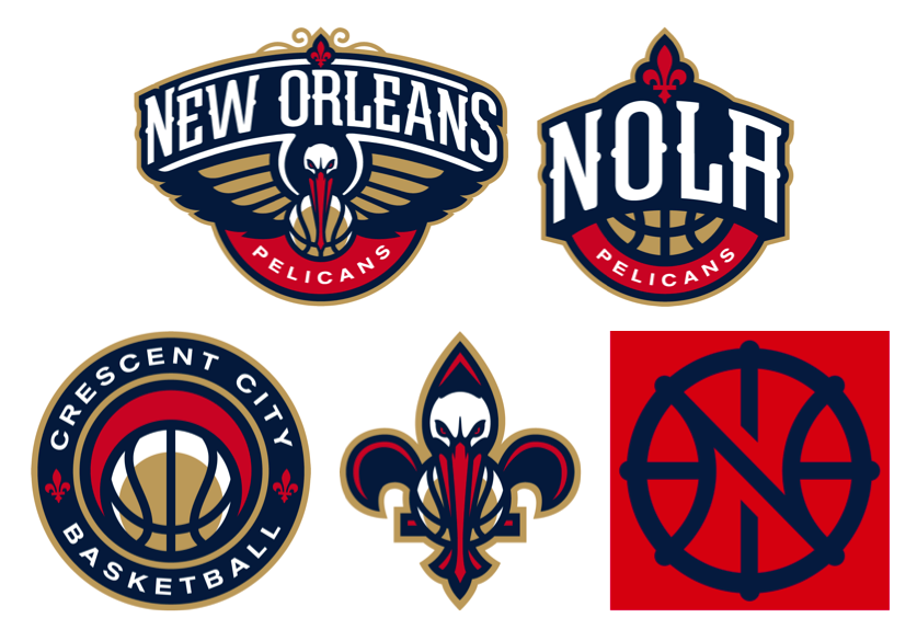
14. New Orleans Pelicans
Logos! Logos! Logos! The Pels still lead the league in number and variety of logos. And most of them are pretty good. Except the one that they use the most. While that one is totally New Orleans, it's still too dated for my taste.

13. Philadelphia 76ers
With the exception of the Charlotte Hornets at 9, the Memphis Grizzlies at 4 and to some extent the Washington Wizards at 3, the top 13 spots in my ranking are occupied by teams that have either (a) found something a long time ago that worked and are sticking with it or (b) have figured out what they had a while ago worked really well and have brought the old logos back. The Sixers resurrected their old look (mostly) but are the sitting a the 13 spot because they couldn't leave well enough alone and invented a Ben Franklin dribbling a basketball logo which just doesn't work for me.


12. Detroit Pistons
Last year the Pistons were 27th in my ranking. This year they are 12th. Something big happened here. And what happened was the Pistons looked to their competition for inspiration.

In 1979, the Detroit Pistons unveiled what I consider to be their classic logo, a stylized red basketball inside a blue circle with the words "Detroit Pistons" in simple block letters in the center of the ball. It was a variant of a logo that went all the way back to their move to the motor city. It was simple, it was clean, it was effective. 

Then in 1996 they decided that awesome look wasn't good enough so they switched their logo to some kind of flaming horse with tailpipes and accented the whole thing in some sort of dark aqua. They also switched their font to some sort of thing that has some letters with pointed ends now and then. Terrible stuff. Unbelievably, it lasted nine seasons before they switched it back to a red, white and blue basketball logo, albeit with the terrible font intact. That basketball though was rotated from the old logo and the words were curved.

So now things have come full circle and the Pistons are back close to the 1979-1996 look. Mostly. The font is still a bit different and there's silver border around the whole thing. I'll take it. I actually like the silver lining and the font's not that objectionable when the letters are small.

In case you are wondering why the Pistons (and all these other teams that are adopting something close to their past branding) don't just go back to what they had, they can't. All the retired logos belong to the NBA's Hardwood Classics brand and they don't let teams reappropriate them once they give them up the first time. That's why the Pistons, Hawks and Sixers all have logos that are 95-99% (but not 100%) identical to past logos.

11. Utah Jazz
Speaking of awesome reinventions of the past, I love the Jazz logos. I just don't love them at all in Utah. Please find another name for this team.


10. Portland Trail Blazers
The Blazers have one of the most unusual logos in professional sports. It's an abstract representation of a five on five basketball game that could only have been cooked up in the late 1960s or early 1970s. And I love it. The Blazers have tweaked the original version a couple of times and they have done it again this offseason. Gone are the tapered ends to the swirl lines (I just made that term up) which is an upgrade for me. Also gone is the lines dying into the other side of the swirl. Not sure that change works better or worse for me. Still one of my favorite logos out there. Just got good enough to move them inside number 10 this year.

9. Charlotte Hornets
8. Miami Heat
7. Golden State Warriors
6. San Antonio Spurs
5. New York Knicks
4. Memphis Grizzlies
3. Washington Wizards
2. Boston Celtics
1. Chicago Bulls

So the top nine in my ranking last year did something smart: they didn't change a thing, although the Knicks did roll out a 70th anniversary logo that is super sharp. And that means that this year's top nine is the same as last year's. I still think the Hornets and Dubs have too many choices in their logos but honestly the secondary logos are in many ways better than their primaries. I still hate the fact that the Heat are in the top nine and my growing distaste for the Celtics had me for a minute considering sliding my beloved Wiz ahead of them before realizing I have absolutely no good reason for doing so.

The Bulls are still number one. If there's message about the value in never changing, it's the Bulls consistently being in the top spot. 52 years, one logo. 'Nuff said.

G-League logos up next. What a mess that collection is!

February 4, 2016

What About Portland?


I used to hate the NBA All-Star Game. Maybe hate's a strong word. But in years past I really had no use whatsoever for the mid-season exhibition basketball game where most of the players that I love to hate showboat while nobody (and I mean nobody) plays defense. Even when Gilbert Arenas, Antawn Jamison and Caron Butler were making appearances in the game over a four year span about a decade ago, I never really tuned in for very long.

Then last year everything changed. I snagged some tickets to the big events on All-Star Weekend in New York City and saw the true value of the experience. From the game itself on Sunday to All-Star Saturday night to practices to press conferences to autograph hunting all over the city, it was a non-stop weekend of NBA superstar immersion. And it was quite honestly pretty fantastic. I never could have imagined such a transformation in my attitude about something based on a frigid long weekend in America's best city (sorry, D.C. but it's true!).

Washington last hosted the All-Star Game in 2001, my first year as a Wizards season ticket holder. I didn't do much at all that weekend basketball-wise except attend the Rising Stars Challenge on Saturday afternoon. I bought a $10 (yes, you read that right) ticket at the box office and spent a couple of hours watching the rooks and sophs go back and forth while sitting one row closer to the court than now-majority owner Ted Leonsis (Ted was in his box; I was in the last row in the 100 level at what was then MCI Center in front of his box).

That year I was actually offered tickets to the All-Star Game. I think the deal from the Wizards was that if I bought 100 upper deck tickets for a regular season game and donated them to charity, they'd get me some 400 level seats for the All-Star Game. I passed, not having a spare $1,000 or more kicking around for such an indulgence at that time in my life. But after last year's All-Star experience, I started to wonder if D.C. was due for another All-Star weekend. I mean in the past 16 years since I've been a season ticket holder, both Houston and New Orleans have had the game twice. Why can't Washington get another shot? Aren't we due?

Me and Earl Monroe hanging out at All-Star Weekend 2015.
So logically, the answer to that question is NO! There are 30 teams in the league now so theoretically every team should get to host the All-Star Game once every three decades. But that's clearly not the way it works for Houston or New Orleans, so why can't Washington be an exception too? The Wizards / Bullets have hosted All-Star Weekend a total of three times in the 65 (including this year) year history of the event: 1969 (in Baltimore), 1980 (at the Caps Center in Landover, MD) and 2001 at our current arena on F Street. Maybe if the NBA waits the same 21 years between games like they did last time, maybe we get the game back here in 2022. Maybe.

Probably not. As it turns out, there are far more cities that are "due" than Washington is. In fact, it ain't even close. Boston holds the longest current All-Star Game-less streak at 52 years, including this year; 53 if you consider they aren't hosting it next year (Charlotte, NC is). Boston was home to the first and second ever NBA All-Star Games and hosted the event four of the first 14 years it was played (remember the league was a lot smaller back then). But they haven't played it in beantown again since 1964 when the league had a total of nine teams. That's a long time.

Other cities have never hosted the game at all. Oklahoma City which has been the home of the Thunder for nine years (including this one) has not yet been granted an All-Star Game. Nor has Sacramento, which has been the home of the Kings since 1985. But while the game may never have been played in those two cities before, the franchises that became the Oklahoma City Thunder and Sacramento Kings have hosted. The Thunder had the event in 1974 and 1987 as the Seattle SuperSonics and the Kings hosted All-Star Weekend in 1956 and 1966 as the Rochester and Cincinnati Royals respectively. Neither franchise has waited as long as the Celtics in Boston, although Sacto comes close.

Besides OKC and Sacramento, there are two other cities that have also never had the All-Star Game. One of these, Memphis, is a relative newcomer to the NBA, moving from Vancouver in 2001, although it seems like the Grizzlies, whose name worked way better in Vancouver, have been in that city forever. So while I feel for the Memphians who crave this event at the FedEx Forum, if I were running the show I'd put both Boston and Sacramento ahead of them. Yes, I'd put OKC at the back of the line here.

And then there's Portland. The Trail Blazers entered the NBA in 1970, 45 seasons ago, at a time when there were only 17 teams in the league. They've been in the same city under the same name for their entire history and as yet have never been awarded an All-Star Game. Since Portland entered the league, and including this year, the All-Star Game has been held in 28 different cities or metropolitan areas. Seven cities have had the game twice; three have been hosts three times; and Los Angeles (if you include Inglewood as Los Angeles) has had it four times. The game has been played in five football stadiums over that period, one city that no longer has a franchise (San Diego) and what that has never had a team located there (Las Vegas). But Portland's never had it. Not even once.

Apparently the city has put in an application to host the game in 2017 or 2018 but the NBA is concerned about the number of hotel rooms in town. It seems to me that the league could find it in it's heart to let a franchise which has been in the same place for almost 50 years have the event once, even if it means a lot of staying in the suburbs or elsewhere. There's one thing for sure: Portland's due!

Large scale graphics of jerseys at Barclays Center 2015: John Wall (woo hoo!!!) and LeBron James (BOOO!!!!!!)

August 19, 2015

NBA Logo Rank, Part 4


Now things are getting good. Part four of my logo rank is peppered with some excellent graphic designs and for the first time, we actually see an entire family of logos with no missteps. Still some clunkers out there but the quality is greatly improved over part three. Let's see what we got.

12. New Orleans Pelicans
The New Orleans Pelicans are one of two franchises where three logos just wasn't enough. Oh no…for them there's a full five spot of logos to choose from. Some hit and some definitely miss wide of the mark by a good distance. But overall, there's more good than bad here. Let's start with the bad news.

I don't like the Pelicans primary logo (top left). I get that it's very New Orleans; I could see this thing gracing the front of some old paddleboat steaming up and down the Mississippi while a boatload (pun intended) of tourists check out the scenery on the banks and chow down on gumbo or red beans and rice. I appreciate the local flair but I don't like it as a basketball team logo. There's too much New Orleans and not enough hoops; I'd have killed myself for writing that in some other posts, right?

I also don't care for the Pels' fifth logo (bottom right), a weak "N"/"O"/basketball motif that somehow the Pelicans made available to themselves in four different color combinations.

Getting better, but still not there, I'm not crazy about the "NOLA" logo except I think it's more like a basketball logo than the two I have trashed so far. I really believe the Pelicans made some smart choices with their color scheme. Most logos would look good in the red, dark blue and gold colors they picked for their team. This one might have benefitted from the uni colors.

The last two logos, however, are strong to freaking awesome. I like the Pelican-de-lis a lot. It's completely New Orleans and concise enough to be a basketball centric logo at the same time. Don't get me wrong, it's no fleur-de-bee like the old Hornets had when they were in town, but I like it a lot. I especially like how the Pelican's beak forms the bottom spur of the fleur-de-lis.

And then there's the Crescent City Basketball logo, which I absolutely LOVE. New Orleans was originally laid out on a crescent shaped bend in the Mississippi River and acquired the nickname based on its early settlement patterns. This logo pays homage to that moniker and reflects a crescent shape a couple of times in the shadow on the basketball and the negative space above it. I think this logo is perfect for the city and those in the know about one of the city's other names.

So why only 12th? Well, I'm considering all logos here and the Pelicans' bad logos aren't enough to allow their good ones to soar. I've spent enough time here; let's move on.


11. Philadelphia 76ers
Oh, Philadelphia, you had it so right and you went and messed it up.

I LOVE the old 76ers logo. It's a basketball looked at almost straight on with that gorgeous "76" and the 13 original stars from the first Stars and Stripes floating above. It's graphically balanced and it's a perfect reflection of a basketball team named the 76ers. Admittedly, the old logo is much like the current primary logo (above left). But the old logo placed the ring of stars so it doesn't break the seam of the basketball. It's the small things in life sometimes. The Sixers used the old logo from 1977 to 1997 and brought it back just six years ago before tinkering. Should have left it alone.

Having said all that, the current logo is almost as good and I dare say I like the alternate logo on the right above just as much as the old logo that I love.

But Ben Franklin dribbling a basketball? This thing doesn't seem right, plus an 11 year old kid can't draw that. No way. I predict Ben will be shelved in the next few years. Heart's in the right place. I'm just not getting it.

Good show from the Sixers here. If they'd have left things alone they would have been top ten for sure.


10. Portland Trail Blazers
Of all the logos in the NBA, there has to be more confusion surrounding the Portland Trail Blazers logo than any other graphic representing a team. Let me explain why this logo is good enough for 10th in the league in this particular ranking.

Look at any other logo in the NBA and you could probably take a shot at guessing the team nickname. OK, maybe not the Magic but you would at least stand a chance of saying "oh, I get it!" when someone gave you the answer. And maybe not the Thunder either but after some cajoling and explaining, you might get it enough to beg off whatever Thunder fan was giving you a tutorial on the subject.

But the Blazers? The team that was named after the folks who moved out to Portland on the Oregon Trail. No way can you make sense of this. It didn't always look quite this way but it's close enough to the original to make a strong connection and the Blazers have stuck to this look in a totally unwavering fashion with the possible (and I mean very possible) inexcusable introduction of a less sensical secondary logo in 2002 that they killed four years later. Hooray for tradition!!!!

The reason the Portland Trail Blazers logo makes no sense is that it was generated from a when, not a what. And that's just the exact same reason it is so awesome. It's a design that signifies a modern (and by modern I mean 1970 when the Blazers entered the league) interpretation of the game of basketball. The five lines on each side of the center circle represent two teams of players working against each other in a game of hoops. Get it? It doesn't necessarily matter if you don't. I think it's so awesome that they commissioned this type of logo and stuck with it exclusively for 45 years. There's no other NBA logo like it. And there likely never will because there will likely never be another 1970.


9. Charlotte Hornets
The Hornets are another team (like the Pelicans) who can't seem to have enough logos. They actually have six but the other two not shown above are just variants of the primary logo on the left above.

I love pretty much everything about the Hornets re-brand. Anything in Charlotte (well, except a Raptors nickname) would have been an improvement over the dreadful Bobcats name. They could have just brought back the old friendly hornet from the late 1980s but I'm glad they didn't. I like the newer fiercer Hornets collection of logos better than the cuddly cartoon one.

Just like the Pelicans, I think this collection of logos is a bit of a mixed bag, although far superior to the Pels' choices. I like the primary logo. I think it's visually stunning on a first glance although I do think the appeal wears off over time. I'm not a fan of the second logo above (what I'll call the "Queen City" logo) which is very reminiscent of one of the old Bobcats' logos. I'm not knocking it just because it reminds me of the Bobcats; it's actually pretty awful other than the hexagonal shaped "C". I'm not sure if MJ told his re-branding firm to give him a discount if they could re-use one of the old Bobs' designs or what. Memo to the entire Hornets franchise: don't ever go back to anything even smacking of Bob Johnson's ego drive nickname.

But the last two logos on the right I really like. The hornet in profile looks dangerous in attack mode. It's dynamic and forceful and I love both the basketball in the hornet's venom filled belly and the fact that the hornet's attack stance makes an abstract "C". I also like the Buzz City logo inside the hexagonal hornet's nest cell shape, although I don't believe Charlotte is actually referred to as Buzz City except as the home of the Hornets. I still like it. I'd wear shirts with this logo on it.


8. Miami Heat
I hate the Miami Heat. I hate that they swept the Wizards 4-0 in the second round of the 2005 playoffs (long memory here) and I hate that they conspired to stack the deck against the rest of the league by teaming up LeBron James, Dwayne Wade and Chris Bosh to make four straight finals. If it wasn't for the state of Texas, they might have won all four. Ha ha by the way.

I love the Miami Heat's primary logo. It's only slightly different in color from the original 1988 logo and that's quite honestly because whoever designed this logo got it right the first time. You never need to change this logo, Miami. EVER! I've written about how difficult it is to represent abstract terms like Magic and Thunder in logos. The Heat have done it perfectly here with their nickname. It simultaneously represents their name, the concept of heat and references basketball by showing a shot from an "on fire" shooter dropping through the hoop. Yes, I know, there's no net.

So on that basis, the Heat should be like top one or two right? Well…no, because in 2008, the Heat decided to introduce the absolutely horrendous "MH" alternate logo. I don't even want to write about this thing. It's clunky, ugly and I hate the way the M and the H are merged. You are costing your team a top spot here, alternate logo.


7. Golden State Warriors
To this point in my countdown, there have been no teams who's set of logos I like across the board. The Warriors change that. 

In 1969, the San Francisco Warriors introduced a new circular logo showing the Golden Gate Bridge in silhouette with the words "The City" above the logo. The current Warriors logo introduced in 2010 is an updated more modern version of that logo and it's a killer design. It represents the Bay Area, reflects the tradition of the Warriors and is worn on their uniforms in a way that no other logo in the NBA is. I love it. And I think so do the majority of other people across the league. 

I also really like the other two logos introduced by the team as part of their re-brand. Yes, the "W" in a circle is pretty simple but it's straightforward and elegant. I love the California map logo also. I am generally in favor of putting maps in any sort of graphic representation. This one works especially well because the Warriors are (currently) named after the entire state of California.

So why aren't the Warriors higher? Well, it's because while I can enjoy each of the logos on its own and as a total collection, there's nothing that amazing about any logo except the primary logo.

The last six are next. In alphabetical order by city: Boston Celtics, Chicago Bulls, Memphis Grizzlies, New York Knicks, San Antonio Spurs, Washington Wizards.

August 25, 2014

NBA Team Name Rank, Part 3


So here it is: Part 3 of my three part series of posts about how awesome or terrible or somewhere in between each NBA franchise's nickname is. Hopefully by now you have pored over the first two parts and are eagerly awaiting the listing of the top ten, culminating in the naming of a winner of sorts. Let's get right to it.

Category Nine: Good Stuff
So at this point, all the team nicknames are pretty good, meaning relevant and a little inventive and centered around things which are mostly readily identifiable. There are no more weather nicknames, no more non sequiturs and no more silliness (you know who I mean, Toronto Raptors). This late in the countdown, every team has some sort of legitimate credibility.


10. Boston Celtics / 9. New York Knicks
Their are many many similarities between the Boston and New York NBA franchises. They are the only two original NBA franchises who remain in their original cities; they both have winning traditions (stop laughing, Celtics fans); and they both named their teams after a portion of their own city's population.

The Celtics of course are named after the Irish immigrants that settled in Boston after the Great Irish Famine of the early to mid-1800s. Irish settlers were typically poor and had neither work nor food in their own country and so traveled across the Atlantic to the nearest possible port which is how a lot of them ended up in Boston. Once in Boston they formed a close knit community of lower class or blue collar workers. No nickname for a team in the late 1940s has a good chance of being all inclusive when it comes to describing a city's population. The Celtics name does a pretty good job though.

The Knicks are named after Father Knickerbocker, a city mascot of sorts that dates back to the days when the city was named New Amsterdam. The character was popularized in the early 1800s by Washington Irving and ultimately was adopted as a term to describe the city's aristocracy. Not as cool as working class Irish; I get it. But no opinion poll that I write where New York and Boston are tied will give the tiebreaker to Boston. The New York New Yorkers finish in ninth; the Boston Bostonians finish tenth.

8. Indiana Pacers
The American Basketball Association had some pretty good team names. Of the four franchises absorbed into the NBA as part of the NBA/ABA merger, three are in my top eight. The other one, the Nets, are not. The Indiana Pacers are the first of three consecutive former ABA franchises. I love the Pacers name because there is a dual meaning (just like the less impressive Thunder nickname).

There are two kinds of famous sporting races held in Indiana. The first and most famous is the Indianapolis 500 held annually at the Indianapolis Motor Speedway. Every one of those races has a pace car, which leads the field to the starting line. The second is a little known (at least to me outside of Indiana) horse racing tradition featuring harness racing pacers. Could the name be better? Sure, it could and it definitely causes mascot issues for the team. But it's better than most.


7. San Antonio Spurs
How scary is a spur? Well I think the answer is not very, unless you are a horse or in a fight with a dude using a spur as a weapon and you are (a) unarmed and (b) unable or unwilling to outrun him. But the Spurs name is perfect for a Texas team and it blows away the other two Texas franchises, the Mavericks and Rockets. There's an outlaw imagery about Texas more than any other state so I think the name works perfectly for a Lone Star State franchise, even if it is a clothing accessory of sorts.


6. Denver Nuggets
The first recorded gold find in what is now the state of Colorado was reported in 1850, when Lewis Ralston, a settler bound for California, dipped his pan into a river and discovered gold. I think if I had found some gold in a river on my way somewhere, I would have stuck around to see what else I could find but for whatever reason, Ralston did not. Instead he returned eight years later sparking the first of several gold rushes to Colorado. Denver had a small one that same year which ended quickly when prospectors determined there just wasn't a whole lot of gold around Denver.

There have been several Denver Nuggets teams over the years. The first was an AAU (Amateur Athletic Union) team founded in 1932. They were followed by an NBL franchise 80 years after the Pike's Peak Gold Rush. The present Nuggets came into existence in 1974 when the ABA's Denver Rockets switched nicknames in anticipation of an NBA/ABA merger (can't have two teams with the same name after all). I like the Nuggets nickname. It's not exactly fearsome but it's uniquely Denver. Good enough for sixth place anyway.


5. New Orleans Pelicans
The New Orleans Pelicans have played exactly one season in the NBA under their current name. Before the 2013-2014 season they were inappropriately named the Hornets (stay tuned for why it was inappropriate). When the franchise announced the decision to change the team name to the Pelicans, state bird of Louisiana by the way, they drew some fire from some folks. I mean who's going to be afraid of a Pelican?

At the time of the initial name change announcement, I wrote about how impressed I was with the team's decision to change it's name without a relocation effort. I remain as impressed, if not more so, today. Last January, I actually had the Knicks and Nuggets as better location specific nicknames; I may have re-considered since then. I just think it takes balls to do something that had only happened twice before in NBA history. And for those folks who think pelicans are not fearsome, ask the woman in the picture above. I love the Pelicans name!


4. Chicago Bulls
This past summer, I took a trip to Madrid and went to see a bullfight (however one-sided that turned out to be). Until then I didn't really understand how powerful and scary a bull can be, even one with a clear disadvantage to armed men who outnumber the creature. After that experience, one of the last things I want to be chased by is a bull. I can't imagine why anyone would consider running with the bulls in Pamplona, Spain each year. I assume some of the folks in the photograph above might have regretted their decision to do so.

If there's a city with an NBA franchise that deserves the Bulls nickname, it's Chicago, so it's appropriate that their team carries that name. From the end of the Civil War to the early 1920's, more meat (mostly pigs and cattle) was processed in the city of Chicago than any other city in the world. No other American city is more identified with cattle slaughter (is that a good thing?) than the windy city. The Bulls name both reflects the history of the city and it ends up being way more than the city name with some arbitrary animal. Take that, Stuart Pritchard.

So I guess these guys are the original 76ers, right?
3. Philadelphia 76ers
The original Phildelphia NBA franchise was called the Warriors, who now reside in Oakland, California under the Golden State name. The folks that moved the Syracuse Nationals to the City of Brotherly Love in 1963 and renamed the team had a better idea.

No city except maybe Boston (and then only a maybe) was more important to the original 13 colonies' declaration of independence from Britain and the subsequent Revolutionary War. The Declaration of Independence document was signed there, Benjamin Franklin called the city home and the first Continental Congress was established there. Heck, if it hadn't been for slave owners in the south, Philadelphia might have become the capital of our nation. This was a tight call with the Bulls for the three spot but I'm giving the nod to Philly, despite the fact that a bull is way scarier than an 18th century American aristocrat with a pen.


2. Portland Trailblazers
One of the stories I love the most about American history is the expansion of the country west to the Pacific. From Lewis and Clark's search for the northwest passage to the annexation of parts of Mexico to the discovery of gold in California and Colorado to the settlement of vast tracts of available land in places like Oklahoma. I can't imagine how scary and wonderful expanding our nation west was for the people who did it in search of a better life for their families.

One of the most famous journeys west by regular people was the settlement of Oregon by the people who traveled to that territory via the Oregon Trail. The Trail connects Missouri to Oregon and is 2,200 miles long. I find it amazing that 400,000 people made the journey by foot and horse and wagon over an unpaved trail through sometimes hostile wilderness in a forty year span from about 1830 to about 1870. The Portland NBA franchise was another of the many named by public contest. The original winner of that contest was Pioneers, which works just great, but is shared by the nearby Lewis and Clark College. Trail Blazers finished second but won by disqualification of sorts. I like Trail Blazers better; I like it so much that I think it's second to only one other name.


1. Charlotte Hornets
I can't believe that any ranking system I created has the Charlotte Hornets at the number one spot but that's just what's happened here. Let me say it here so it's clear: I LOVE the Hornets name. I think it represents the very best of what a sports franchise name should be. It's ferocious, you can make a cute mascot out of it for the kids and it's location specific in a very obscure but very measureable and relevant way. This is a legit first place finish; I'm not just giving the Hornets a bump for ditching the Bobcats name a couple of months ago. Although honestly, they might have finished 30th with the old name.

As of this past spring, there have been two Charlotte Hornets franchises. The first was established as an expansion franchise in 1988 but split town for New Orleans in 2002 under a cloud of shadiness by the then owner, George Shinn. When the team headed south to the Crescent City, they kept the name for a bit until they decided that the Hornets name wasn't for them (see 5 above) and gave it up. Major props to Michael Jordan (did I really just write that?) for picking it up instantly and moving quickly to get the name back in the Queen City.

The original Hornets nickname (surprise, surprise!) was the result of a contest to name the team. I know, right? It's so surprising! Contests have yielded some crappy team names over the years (see 19 in Part 2). But this one is truly brilliant, plus if there were no contest here, we'd be rooting against the Charlotte Spirit. During the Revolutionary War, the British commander Lord Cornwallis referred to the city as a "veritable hornets' nest of rebellion" which inspired the name of a minor league baseball team in the city which was established in 1901. The name was later used for a World Football League team. Despite the borrowed or stolen name, this nickname wins my NBA team name rank.

So that's it. I'm still in disbelief that the Charlotte Hornets won anything I put my name to but that's the way it is. And since it's August 25 today, I think I can declare my project to rank all 30 NBA team nicknames a success. Now I have to think of something to do next August.

August 9, 2013

NBA Mascot Rank, Part 2

I know what you are thinking, Sly. I'd be pissed about the Knight too.
Last week I posted the first part of my NBA mascot rank, an all too detailed ranking of all things mascot in my favorite sports league. That countdown continues in this Part 2, which deals with mascots who are just barely making the minimum amount of effort to be a mascot or are confusingly relevant/irrelevant. We start in the northeast.


24: Lucky the Leprechaun, Boston Celtics
Of all the teams that actually have a mascot, the Celtics mascot, Lucky the Leprechaun, is the absolute worst and therefore ranks lowest of all the primary mascots in my countdown. Memo to the Celtics: dressing a guy in clothes with no mask, no fake fur or outrageous costume does not constitute a mascot. It's just a dude in a green costume and a sometimes beard.

All the tradition and pride that comes with the Celtics organization just isn't enough to compensate for this guy walking around looking for his pot of gold. He even appears in the media guide as the mascot. There's no illusion here and it's just no fun. Marginally better than having no mascot but hands down the worst primary mascot in the NBA. But not by much...


23: BrooklyKnight, Brooklyn Nets
Before the 2012-2013 NBA season, the Nets moved from New Jersey to Brooklyn in what was supposed to be some sort of glorious return to the city where they started some 40 plus years earlier as part of the now defunct ABA. As part of the move, the Nets rebranded their entire franchise, which included everything from their uniforms to their mascot.

When the team was located in New Jersey, the Nets' mascot was a silver fox, whatever that is. This has to be one of the more puzzling mascots of all time. When I think of the Nets franchise, whether it's in New Jersey or in New York, I do not think of a fox. I don't know how I would necessarily create a mascot to represent a team called the Nets, but a fox wouldn't spring to mind in any way. So when the Nets left Jersey after 35 seasons there, they understandably left Sly the Silver Fox to fend for himself in the swamps of northern New Jersey. They had to replace him with something more relevant and cool, right?

Wrong! Instead of a silver fox, the Nets' mascot last year was a knight. But not just a regular knight. The new Nets' mascot is a superhero sort of futuristic knight. Huh?? Yes, that's an appropriate reaction. Totally not relevant. I generally like what the Nets did in re-branding themselves. I think their black and white road unis are really cool (even if their homes look like some sort of upgraded junior high school gym clothes); I love the updated parquet floor; and I even think the name of their dance squad, the Brooklynettes, is really inventive. But I can't see the knight sticking around long. Brooklyn's supposed to be gritty, right? The knight's not.


22: Burnie, Miami Heat
Oh, God...really?!?! What on Earth is this thing?

How do I start to explain the Miami Heat mascot? It's an orange flame with a basketball nose and white hair? Yep, that's about it. I'm sincerely hoping the Heat got a discount for this thing. How did the advertising executives paid to come up with a mascot pitch this to the team? I can only imagine them saying what I said at the beginning of this paragraph in a very guilty sheepish way knowing that they cooked this thing up the morning after a South Beach bender in about 15 minutes. They must have gone straight back to the bar after selling this bill of goods for a celebration. At least they got a better name than the mascot itself. Burnie. Get it? It's a real name (Bernie) but also a fire reference ("Burn"-ie). Cool, right? Umm...maybe not. It's a commentary on how bad most mascots are that the Heat finish 22nd here.


21: Clutch the Rockets Bear, Houston Rockets

Clutch is the first of three consecutive mascots in my ranking that beg the question "What does that animal have to do with the city or franchise it represents?" And it's a legitimate question. I'm shaking my head here.

Clutch was invented after the Rockets won their first NBA Championship in 1994, a response to a headline in the Houston Chronicle earlier that postseason declaring Houston "Choke City" after the Rockets blew a game when up 20. So naturally after the team brought home the city's first NBA title, the impulse is to create a mascot to show those bastards over at the Chronicle, right? I get the nickname; it's not bad. But a bear? Do they even have bears in Houston?? And one that looks like this? It looks like a happier version of Ted from the movie of the same name. I don't understand it at all.

Sorry, Clutch, you may be in the now defunct Mascot Hall of Fame (a dubious distinction at best), but in my book you are good enough to finish one notch ahead of Burnie. Not doing it for me.


20: Boomer, Indiana Pacers
Next up in the animal-mascots-with-no-relevance-to-the-franchise-or-city category: Boomer the cat, the Indiana Pacers' mascot.

By all accounts, the Indiana Pacers were named either for Indiana's famous pacer horses or for the Indianapolis 500's pace car. So I'm thinking either race car or horse, right? Nope. The Pacers have a cat. OK, I admit, unlike bears in Houston, there are actually cats in Indiana. That's probably the only reason the Pacers finish ahead of the Rockets in this ranking.

But I think the Pacers really missed an opportunity for a double entendre mascot here a la the Cleveland Cavaliers mascot (just wait until next week). There was potential for something really clever here with a horse mascot. Instead, the cat misses the mark. Next!


19: Blaze the Trail Cat, Portland Trail Blazers
Another cat? Really?

The Portland Trail Blazers, in my opinion, have one of the coolest names in the NBA. The franchise is named for the settlers that came to Oregon via the Oregon Trail. Not a very obvious reference for the casual observer but what an awesome nickname.

I think the Trail Blazers were in a tough spot mascot-wise with this nickname which is probably why they finish one notch ahead of the Pacers with their non-relevant feline mascot. Much like the Nets, I have a difficult time imagining a mascot representing the team. Dressing someone up like a settler or a Conestoga wagon just doesn't seem to make any sense. They finish ahead of the Pacers here because they have a more difficult task so defaulting to a cat seems more forgivable.

But that name...I don't know. Boomer's not much better but "Blaze the Trail Cat"? Come on. The Blazers close out the bottom 40% in my ranking.