
Last Saturday I posted part one of my five part ranking of NBA logos, which is serving as my distraction or methadone (whichever you prefer) for the lack of NBA activity this month. I have to do something to keep my mind occupied. I expect the NBA schedule to be released sometime in the next week or so. Until then, let's get to part two of this countdown.
24. Cleveland Cavaliers
It's no secret that I have no love for the Cleveland Cavaliers franchise, their star player, their second star player, their fans or their owner. That lack of love is not, however, the reason why I put the Cavs 24th on this list. Their logos just aren't very good. I dislike the diagonal wordmark and the huge basketball in their primary logo in addition to the sword running in the opposite diagonal direction. There's no refinement or grace in this logo and it's just too busy.
The secondary or partial logos are a little better although I don't understand how the flag is staying on the razor sharp cavalier's sword unless it's just dull. My favorite by far would be the center logo above. Without my glasses on it looks like a red cocktail onion on a miniature sword toothpick, which is an image far more appealing than anything to do with the Cavaliers, especially if I haven't drunk the martini I'm imagining the logo came from yet.
I just think the Cavaliers branding is clumsy. Better than the Clips, Thunder, Nuggets, Pistons, Kings and Mavs but that's about it. And I wouldn't blame Mavs fans for being upset that they fell one spot behind here.

23. Orlando Magic
Let's get this out of the way right away: I actually think the Magic's partial logo is OK. Maybe even more than OK. Maybe good. It's difficult to draw these non-tangible names like the Thunder, Heat and Magic so on that level, I think the folks who designed Orlando's logo actually did a pretty good job. There are some teams ranked way higher in this list who have one good logo as their saving grace.
But for me and the Magic, I just have one question: is that it? I mean all you have is a shiny basketball with a swooshy looking lightning bolt thing with three stars. Really? That's all you got? I need more out of my basketball team logos. I'm sorry but I just do.
I'm also offended by the font in the primary logo, especially the word "Magic". Where did they find these letters? I'm especially irked by the middle leg of the "M"; why isn't it as long as the other legs of the letter. I'm disappointed by the lack of complexity here. Good effort but it's like getting a naked hamburger patty when I really want a complete sandwich complete with all the trimmings.

22. Phoenix Suns
Why the Phoenix Suns roll out the logos above when they have one of the best NBA logos of all time stashed away in their closet is beyond me. But let's imagine I let that go and evaluate the collection of images based on their own merits relative to the offerings from the rest of the teams in the league.
I'm actually OK with their primary logo. The suns have been using some variety of the streaking skyward basketball sun for a while now and I think it works. I'm not sure I'd put it in the sort of leaning parallelogram with two rounded corners but it's still alright.
It's the other two logos I have a real issue with. The design on the right is especially awful. The colors are terrible (yes, I know they are the Suns colors), the shape of the logo is weird and the negative space sun looks like the logo has been scratched and bitten my some hideous unseen monster. It reminds me of the really really really bad Syracuse University "Artsy SU" logo that the school adopted in the early '90s which most students compared to a stylized dollar sign, which is all the University seemed to care about back then.
Finally, I have to take issue with the "airport code" logo. The graphic of a basketball on fire with a phoenix rising from the image of the flames is I guess acceptable. But an airport code? Really? The concept makes me shudder, especially when I think about the YYZ Raptors or the MSY Pelicans. Not sold. Please, Wizards, never adopt a DCA uni, although I guess it would be better than IAD.
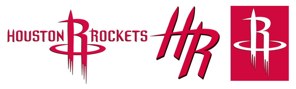
21. Houston Rockets
The Rockets are a team that's suffering from the same sort of malaise that the Magic are suffering from: one logo recycled over and over again, only they do it just a little bit better, even if it's just in the font that they chose. I think the primary Rockets logo is actually fairly pleasing. Depending on the day, I either see the design as two rockets shooting towards space or one rocket on the rise with the scaffold holding it in place next to it.
For those of us who can remember back this far, this Rockets logo replaced one of the worst logos in NBA history, the vicious cartoon rocket racing around a red basketball Earth. Sort of creepy. For that fix alone, the Rockets deserve the 21 spot, no matter how inventive or un-inventive they are. The logo was created when Houston was anchored by Chinese star Yao Ming, which explains the sort of Chinese calligraphy feel to the letters spelling out the name of the team.
If the primary logo here is a success, the secondary or alternate logo is a bit of a fail. The three rockets in the "HR" logo look more like a bank of surface to air missiles ready to shoot down an aircraft invading whatever airspace they are protecting. Good to have in real life maybe but I can do without them in my hoops branding.

20. Minnesota Timberwolves
When I was a kid, I used to spend hours in study hall, mostly in sixth grade, drawing sports logos, mostly football and hockey. Back then, it seemed like all the logos were fairly easy to draw which made them appealing as simple expressions of something that could bring fans together.
The Minnesota Timberwolves logos are the exact opposite of those logos I used to draw as a kid. How can any 11 or 12 year old possibly draw these things? Just look at how complicated they are. For that reason and that reason alone, the Wolves are relegated to 20th place here. I admit, I'd struggle as a budding architect with some drawing ability to hand sketch the Cavaliers primary logo or the Phoenix Suns airport code logo, but I know I could take a shot at the cocktail onion on a sword shaped toothpick or the ugly Suns graphic pretty easily.
There's nothing necessarily that wrong with Minnesota's logos, they are just too complicated for kids to draw. OK, so I really don't like the wolf howling at the basketball moon. I'm just not into it. Can't quite explain why. Next!

19. Brooklyn Nets
If the Timberwolves logos are too complicated, here's some relief: Brooklyn's ain't. These things in fact might be a little too simple. But somehow they work well enough to crack the top 20 on my countdown.
When I've assembled these lists of mascots, names and logos over the past two years or so, there have been some teams in whichever countdown which move around a lot from their initial placement. Brooklyn is that team in this ranking. I initially had the Nets placed at 27th, but the more I look at these designs, the more I'm convinced that simple is OK here.
Don't get me wrong, the shield shaped logo is poor at best and there's no way any of these things work if they are represented in any colors other than just plain old black and white, but there's an appealing straightforwardness to the "B" in the ball with or without the text ring around it that seems to represent what Brooklyn is all about. And I love the fact that the text in the center logo says "Brooklyn New York" rather than "Brooklyn Nets." It's all about the simple blue collar borough here. It works well enough to place 19th, which in reality is not that much to be proud of.
No comments:
Post a Comment